

Poki.com redesign
Poki.com redesign
Poki.com redesign
Indie gaming made simpler.
Indie gaming made simpler.
Indie gaming made simpler.
Indie gaming made simpler.
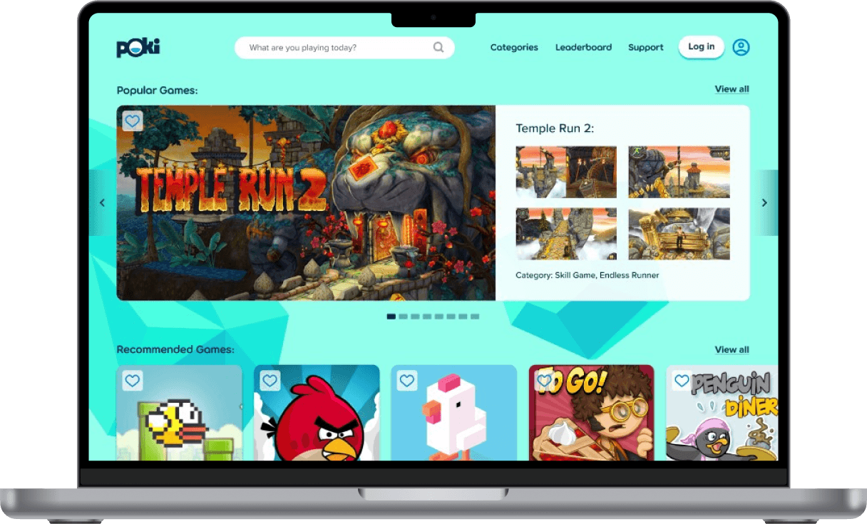
Poki.com reimagined for an enhanced user experience where nothing gets in between the players and their grind. A more modern, responsive, and accessible way to find new games.
Poki.com reimagined for an enhanced user experience where nothing gets in between the player and their grind. A more modern, responsive, and accessible way to find new games.
Poki.com reimagined for an enhanced user experience where nothing gets in between the players and their grind. A more modern, responsive, and accessible way to find new games.
View Prototype
Background
Background
Background
Poki.com provides instant play games that are great for quick play interactive sessions with family and friends. The site also acts as an outlet for boredom and stress relief at any point for the regular user who possesses or are developing an interest in gaming. Its platform allows game developers and players to connect as the site gives first access to certain newly released games that players can access on Poki.com for the very first time.
Poki.com provides instant play games that are great for quick play interactive sessions with family and friends. The site also acts as an outlet for boredom and stress relief at any point for the regular user who possesses or are developing an interest in gaming. Its platform allows game developers and players to connect as the site gives first access to certain newly released games that players can access on Poki.com for the very first time.
Poki.com provides instant play games that are great for quick play interactive sessions with family and friends. The site also acts as an outlet for boredom and stress relief at any point for the regular user who possesses or are developing an interest in gaming. Its platform allows game developers and players to connect as the site gives first access to certain newly released games that players can access on Poki.com for the very first time.
Role:
Role:
Role:
Role:
Researcher, Product Designer
Researcher, Product Designer
Researcher, Product Designer
Researcher, Product Designer
Skills:
Skills:
Skills:
Skills:
User Research, Wireframing, Branding, Prototyping, User Testing
User Research, Wireframing, Branding, Prototyping, User Testing
User Research, Wireframing, Branding, Prototyping, User Testing
User Research, Wireframing, Branding, Prototyping, User Testing
Tools:
Tools:
Tools:
Tools:
Figma, G-Suite, Optimal Workshop,
Canva
Figma, G-Suite, Optimal Workshop,
Canva
Figma, G-Suite, Optimal Workshop,
Canva
Figma, G-Suite, Optimal Workshop,
Canva
Timeline:
Timeline:
Timeline:
Timeline:
4 weeks
4 weeks
4 weeks
4 weeks
The Problem
The Problem
The Problem

Despite Poki's high user engagement, the website's user interface doesn't take into account many established usability heuristics and accessibility principles created to ensure the user's have a seamless experience navigating websites. The objectives of this redesign is to maintain a user-centric approach that improves the overall site's functionality, user engagement, and efficiency for when user's try to navigate all the newly released Indie Games.
Despite Poki's high user engagement, the website's user interface doesn't take into account many established usability heuristics and accessibility principles created to ensure the user's have a seamless experience navigating websites. The objectives of this redesign is to maintain a user-centric approach that improves the overall site's functionality, user engagement, and efficiency for when user's try to navigate all the newly released Indie Games.
Despite Poki's high user engagement, the website's user interface doesn't take into account many established usability heuristics and accessibility principles created to ensure the user's have a seamless experience navigating websites. The objectives of this redesign is to maintain a user-centric approach that improves the overall site's functionality, user engagement, and efficiency for when user's try to navigate all the newly released Indie Games.
Step 1: Research:
Step 1: Research:
Step 1: Research:


To ensure that our re-design targeted real-life issues that Poki user's were facing, various forms of research were conducted to ensure that our redesign avoided any biases and would work to enhance the site's already successful aspects.
To ensure that our re-design targeted real-life issues that Poki user's were facing, various forms of research were conducted to ensure that our redesign avoided any biases and would work to enhance the site's already successful aspects.
Methods:
Methods:
Methods:
Methods:
Secondary Research
Secondary Research
Secondary Research
Secondary Research
Competitive Analysis
Competitive Analysis
Competitive Analysis
Competitive Analysis
Heuristic Evaluation
Heuristic Evaluation
Heuristic Evaluation
Heuristic Evaluation
User Interviews
User Interviews
User Interviews
User Interviews
The objectives we kept in mind as we conducted our research:
Learn how user's would want to navigate Poki.com sites.
Learn definitive areas of focus to improve on for the site to obtain higher user satisfaction.
Learn the best way to organize Poki.com's layout and information architecture.
Learn how user's use the site responsively on different devices.
The objectives we kept in mind as we conducted our research:
Understand why user's feel motivated to learn a new game.
Understand the steps commonly taken by users when learning a new game.
Learn if there are pain points in the process that users might find demotivating so that we can reduce this tension.
Learn what type of content/support user's find most helpful in the process of learning a new game
The objectives we kept in mind as we conducted our research:
Learn how user's would want to navigate Poki.com sites.
Learn definitive areas of focus to improve on for the site to obtain higher user satisfaction.
Learn the best way to organize Poki.com's layout and information architecture.
Learn how user's use the site responsively on different devices.
Secondary Research:
Secondary Research:
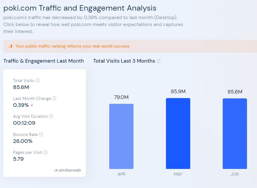
From analyzing outside research conducted on Poki.com's user engagement we were able to find out that:
From analyzing outside research conducted on Poki.com's user engagement we were able to find out that:
From analyzing outside research conducted on Poki.com's user engagement we were able to find out that:






Sources: 1. Similarweb.com 2. Crunchbase.com 3. Semrush.com
Sources: 1. Similarweb.com 2. Crunchbase.com 3. Semrush.com
Poki.com garners about 85.6 million monthly visitors with an average 5.79 pages per visit and an average visit duration of 12 minutes and 9 seconds
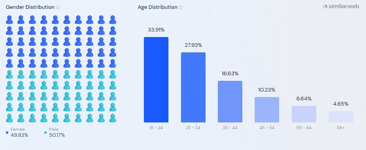
It's user base is almost equally male and female and predominantly from the age range of 10 - 34 years old.
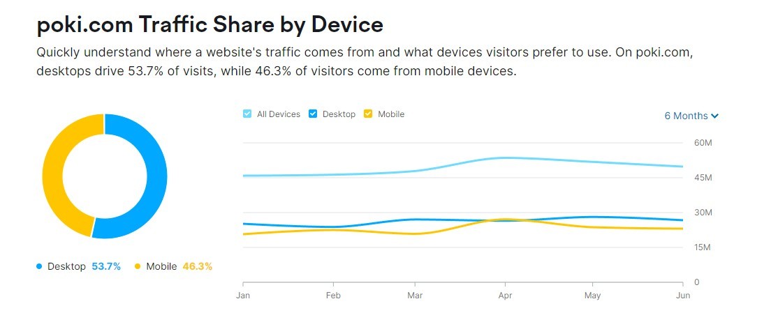
It's top countries of usage are USA, India, and Turkey and in terms of usage by device.
Competitive Analysis
Competitive Analysis
Competitive Analysis
I researched the market for existing competitors to understand how they were already providing this type of service to gamers. We focused on examining their key features, successes, and shortcomings to identify opportunities for innovation.
I researched the market for existing competitors to understand how they were already providing this type of service to gamers. We focused on examining their key features, successes, and shortcomings to identify opportunities for innovation.
I researched the market for existing competitors to understand how they were already providing this type of service to gamers. We focused on examining their key features, successes, and shortcomings to identify opportunities for innovation.
Site's Examined:
Site's Examined:
Site's Examined:
Site's Examined:



Key Findings:
Key Findings:
Key Findings:
All competitor sites including Poki lack informational hierarchy, an established design system, and aesthetics that are adapted to modern day design patterns. Improving these qualities will make Poki stand out from the rest.
Other competitors give user's the opportunity to customize their playing experience through personalized accounts which give user's access to features like favorited games, or personalized content
Other competitors use features like leaderboards to improve the sites community engagement, and overall player motivation.
There is only one existing competitor that provides coaching out of the sites we looked at. (ProGuides) - This indicates that there are more ways this feature could be explored that could give our product a competitive edge against the rest.
There is a gap in the market for more variety game learning content. Most sites focus on MMO's and lack content which would help players in other genres of gaming.
All three competitors incorporate some social aspect into their site for engagement. This includes things such as leaderboards discussion forums, or the ability to chat with other players.
All competitor sites including Poki lack informational hierarchy, an established design system, and aesthetics that are adapted to modern day design patterns. Improving these qualities will make Poki stand out from the rest.
Other competitors give user's the opportunity to customize their playing experience through personalized accounts which give user's access to features like favorited games, or personalized content
Other competitors use features like leaderboards to improve the sites community engagement, and overall player motivation.
Heuristic Evaluation
Heuristic Evaluation
Heuristic Evaluation
To better analyze what usability issues the site was having - a heuristic evaluation was conducted to understand what specific principles could be targeted and improved on Poki's site.
To better analyze what usability issues the site was having - a heuristic evaluation was conducted to understand what specific principles could be targeted and improved on Poki's site.
To better analyze what usability issues the site was having - a heuristic evaluation was conducted to understand what specific principles could be targeted and improved on Poki's site.
User Interviews
User Interviews
User Interviews
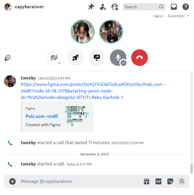
To then garner real live feedback from users, I conducted 5 user interviews through discord. Participants were asked about their experience with Indie games, and were then asked to share their screen and walk through Poki as a site. From this we were able to learn that many of the usability issues we predicted were further validated through our user's experiences.


Affinity Mapping
Affinity Mapping
Affinity Mapping
With our raw user interview data - we sorted that into an affinity map to organize the data and decipher issues as well as strengths of Poki commonly mentioned amongst our users.
With our raw user interview data - we sorted that into an affinity map to organize the data and decipher issues as well as strengths of Poki commonly mentioned amongst our users.
With our raw user interview data - we sorted that into an affinity map to organize the data and decipher issues as well as strengths of Poki commonly mentioned amongst our users.
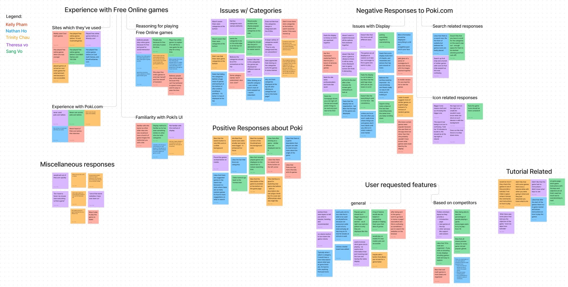


There were several reoccurring patterns amongst the user's experiences.
Many of these patterns further validated the commonness of our problem.
There were several reoccurring patterns amongst the user's experiences.
Many of these patterns further validated the commonness of our problem.
Experience with free online games:
Experience with free online games:
All participants stated that they interacted with Free online games in their current lifestyle or consistently growing up:
Top Competitor sites were: Y8.com and Coolmathgames.com
All said they play free online games as it's an affordable way to pass time when bored or in need of entertainment
3/5 said it's good for exploring new game genres and to identify your preferred niche.
5/5 said that they have never heard of or interacted with Poki.com despite their familiarity with free online games.
2/5 said Poki's user interface was completely unfamiliar to them
3/5 said they were somewhat familiay with Poki's coms layout due to exposure to other free online gaming sites.
Issues with Categories:
Issues with Categories:
One of the biggest concerns mentioned by 5/5 participants in the display and lack of accessible categories on Poki's website.
5/5 weren't aware and disliked the fact that all categories were placed at the the bottom of the explore page after lots of scrolling was done.
5/5 recommended moving the categories to somewhere at the top or edge for more visibility. (keeping them accessible)
Categories were too broad and not placed in alphabetical order
categories also felt pointless as the results after clicking felt random and arbitrary.
Negative Responses to Poki.com:
Negative Responses to Poki.com:
Issues with game display:
5/5 stated that the display of games appeared, "Messy, unorganized, random, and overwhelming."
5/5 stated that the games needed to be re-sorted into more clearly distinct genres in order to make navigating the site more efficient.
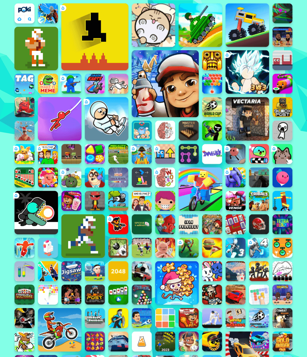
4/5 mentioned that they disliked the random sizing of the game icons (found them distracting and not purposeful)
3/5 said it was hard to infer which games were popular, recommended, etc., based on the layout and icon sizes
Game Search Related Issues:
The search bar/icon wasn't very distinguishable and hard for user's to locate.
Positive Responses to Poki.com
Positive Responses to Poki.com
2/5 appreciated that there were suggested games in the search bar - as this reduced searching time and simplified decision making
2/5 said that they liked the existence of a game description so user's can learn more about the games they're playing
2/5 appreciated that there were suggested games in the search bar - as this reduced searching time and simplified decision making
2/5 said that they liked the existence of a game description so user's can learn more about the games they're playing
User Requested Features based on findings and responses:
Towards the end of the interview - we asked user's directly what type of changes they'd want to see on Poki.com. Identifying these key responses will help us narrow down our focus and better understand which areas of improvement to target first.
General:
5/5 user's requested more information on category types and games sorted into sections like popular, recommended, and newly added
4/5 wanted more instruction on the game - (key binds, objective, tutorials)
2/5 requested a log in feature so game data could be save and a leaderboard could be established to create a sense of competition
2/5 wanted more information on the game icons/display to showcase what type of game the user's would be playing
Based on Competitors:
Video previews for ever game not just popular ones
organized display
shows percentage of user's playing that game for encouragement
Leaderboard for interactivity
Based on Competitors:
Video previews for ever game not just popular ones
organized display
shows percentage of user's playing that game for encouragement
Leaderboard for interactivity
Based on Competitors:
Video previews for ever game not just popular ones
organized display
shows percentage of user's playing that game for encouragement
Leaderboard for interactivity
Step 2: Define
Step 2: Define
Step 2: Define


Now that we're more knowledgeable on the potential issues and solutions to Poki's site, we have to bring our focus back into identifying our target users. This is to ensure our implementations have the most impact on the type of user's who actively or would potentially interact with Poki.com
Now that we're more knowledgeable on the potential issues and solutions to Poki's site, we have to bring our focus back into identifying our target users. This is to ensure our implementations have the most impact on the type of user's who actively or would potentially interact with Poki.com
User Persona
User Persona
User Persona
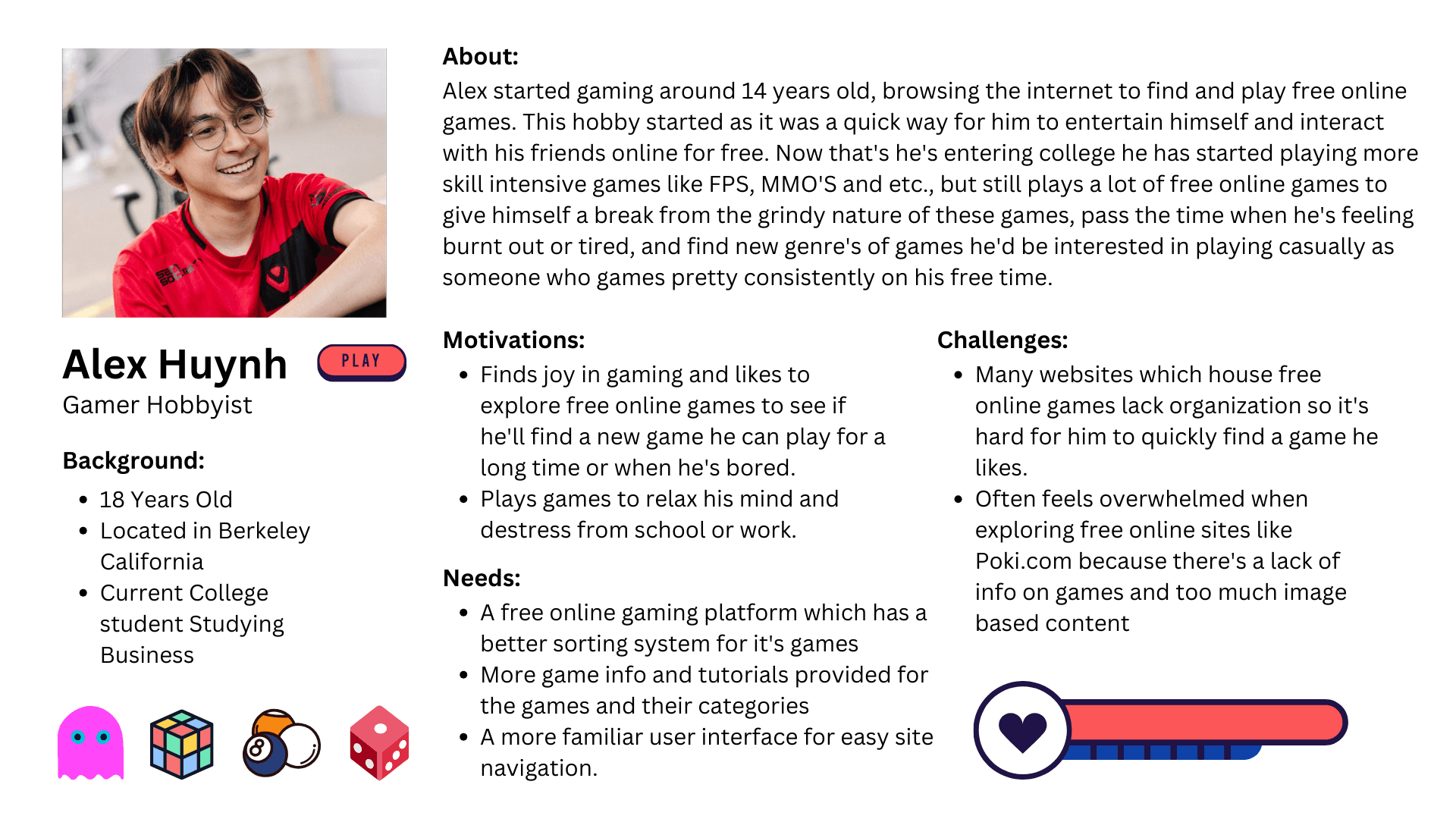
Visualizing our user persona allows me to keep the user in mind and empathize with them through every design decision.
Our user persona allows me to define who would essentially be using our product and what their needs and frustrations encompass. Having note of this allows me to keep the user in mind and empathize with them through every design decision.
Our user persona allows me to define who would essentially be using our product and what their needs and frustrations encompass. Having note of this allows me to keep the user in mind and empathize with them through every design decision.
Our user persona allows me to define who would essentially be using our product and what their needs and frustrations encompass. Having note of this allows me to keep the user in mind and empathize with them through every design decision.


Step 3: Ideate
Step 3: Ideate
Step 3: Ideate


Now by using my research data and putting myself into the shoes of our user persona, it's time to visualize the re-designs we want to implement onto Poki's site.
Now by using my research data and putting myself into the shoes of our user persona, it's time to visualize the re-designs we want to implement onto Poki's site.
Product Sitemap
Product Sitemap
Product Sitemap
Our interview participants as well as Poki.com's heuristic evaluation identified informational hierarchy as one of the larger problems across Poki's site.
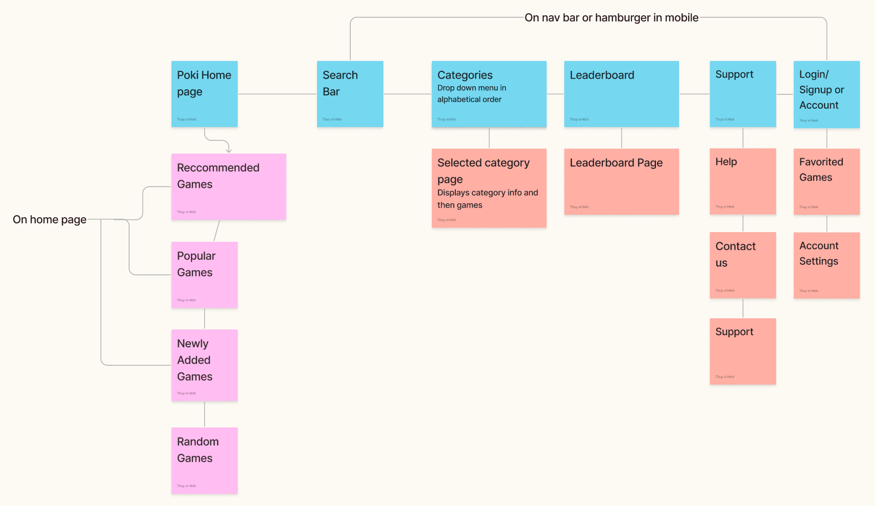
Poki.com lacks proper information display as well as a meaningful way for user's to navigate the site. Therefore a sitemap was produced to help group together similar types of content and establish familiarity with content for the users.


User Flow
User Flow
User Flow
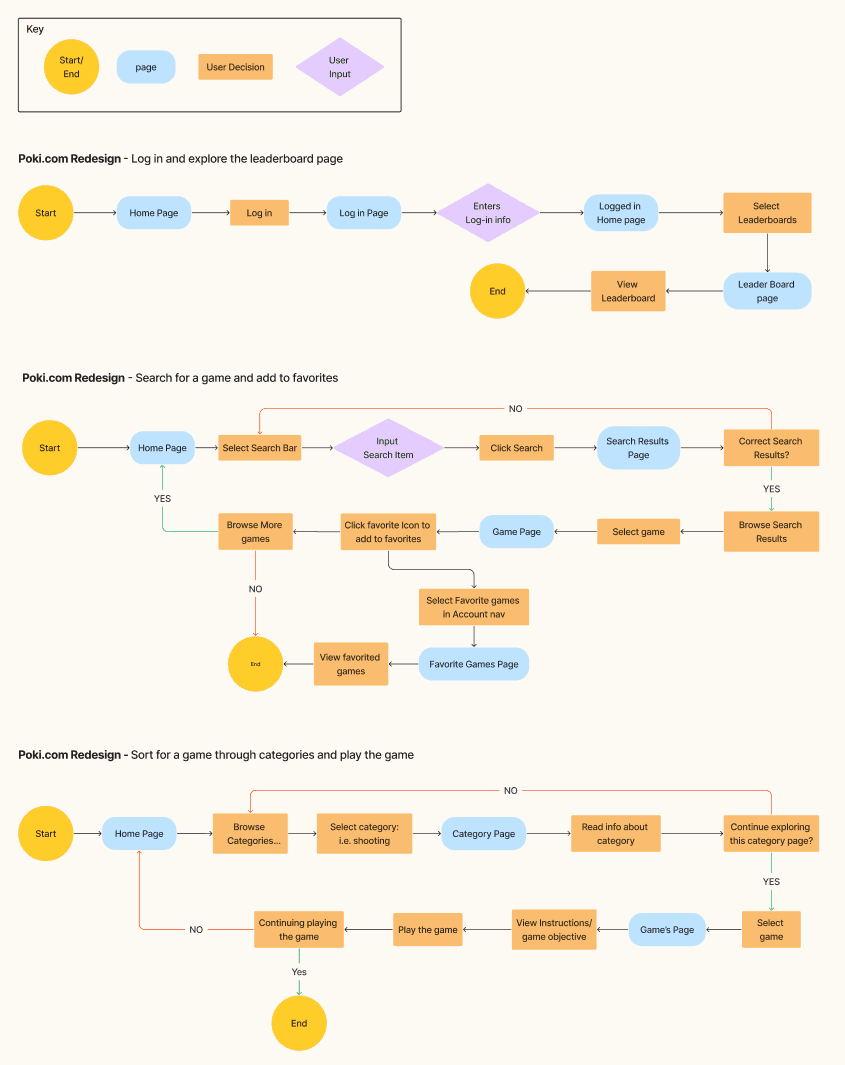
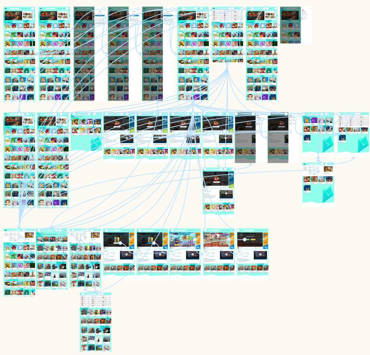
Having a site map allowed us a preview into the types of user flows our audience would potentially interact with and gives us sufficient means for usability testing later on.
These flows were based on real life tasks that our user's stated they would appreciate being incorporated into the site.
Accessing the leader board - after logging in which made it easier for user data and game placements to be recorded, user's could see how others were playing Poki.com in comparison to themselves. (Giving the site a sense of community and competition).
Using the search bar to sort for and quickly find games that they want to play or add to their favorites.
Using the categories to sort through different types of games that they found interesting and would eventually play.


Step 4: Design
Step 4: Design
Step 4: Design


Now that I have a clearer idea of the user flows I want to build, it's time to search for inspiration. As Poki.com's website already has their own branding system the goal is to mainly focus on improving their informational architecture and site layout so that user's can complete their tasks in the most efficient way possible.
Now that I have a clearer idea of the user flows I want to build, it's time to search for inspiration. As Poki.com's website already has their own branding system the goal is to mainly focus on improving their informational architecture and site layout so that user's can complete their tasks in the most efficient way possible.
Design Pattern Research
Design Pattern Research
Design Pattern Research
One of Poki's main challenges is the site's portrayal of games and information in an inconsistent manner. I want to reduce the informational clutter that inhibits user's from staying on the site, or using it to it's full potential.
Therefore design patterns relating to our task flows as well as information display were explored to help us create a brand new site layout.
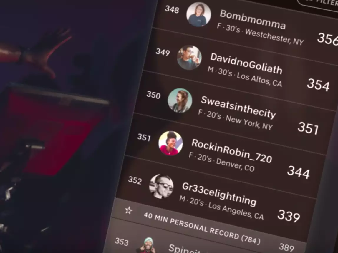


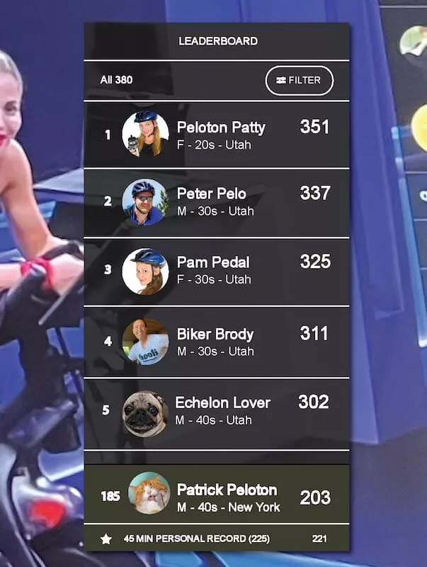


Leaderboard display: Peloton
Leaderboard display: Peloton
Leaderboard display: Peloton
Leaderboard display: Peloton
Rank placement, user icon, and point accumulation displayed in a straight forward easy to read manner.
Rank placement, user icon, and point accumulation displayed in a straight forward easy to read manner.
Rank placement, user icon, and point accumulation displayed in a straight forward easy to read manner.
Rank placement, user icon, and point accumulation displayed in a straight forward easy to read manner.
Ranking is filterable displayed in clear hierarchy with specific categories.
Ranking is filterable displayed in clear hierarchy with specific categories.
Ranking is filterable displayed in clear hierarchy with specific categories.
Ranking is filterable displayed in clear hierarchy with specific categories.
Point system can be applied in a similar manner for Poki's games.
Point system can be applied in a similar manner for Poki's games.
Point system can be applied in a similar manner for Poki's games.
Point system can be applied in a similar manner for Poki's games.


Search and Favorited content: YouTube search and account data
Search and Favorited content: YouTube search and account data
Search and Favorited content: YouTube search and account data
Search and Favorited content: YouTube search and account data
Search bar is center and present and accessible at all times
Search bar is center and present and accessible at all times
Search bar is center and present and accessible at all times
Search bar is center and present and accessible at all times
Content is displayed in big cards with relevant information under for visual association and hierarchy.
Content is displayed in big cards with relevant information under for visual association and hierarchy.
Content is displayed in big cards with relevant information under for visual association and hierarchy.
Content is displayed in big cards with relevant information under for visual association and hierarchy.
Account portal lets users access saved content they interacted with or enjoyed.
Account portal lets users access saved content they interacted with or enjoyed.
Account portal lets users access saved content they interacted with or enjoyed.
Account portal lets users access saved content they interacted with or enjoyed.
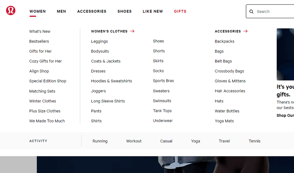


Categories display:
Categories display:
Categories display:
Categories display:
Categories displayed within navigation bar making it easily accessible at any point on the site.
Categories displayed within navigation bar making it easily accessible at any point on the site.
Categories displayed within navigation bar making it easily accessible at any point on the site.
Categories displayed within navigation bar making it easily accessible at any point on the site.
Categories are displayed by relevancy to each other in some manner.
Categories are displayed by relevancy to each other in some manner.
Categories are displayed by relevancy to each other in some manner.
Categories are displayed by relevancy to each other in some manner.
Recommended categories displayed on the left side of panel for immediate access.
Recommended categories displayed on the left side of panel for immediate access.
Recommended categories displayed on the left side of panel for immediate access.
Recommended categories displayed on the left side of panel for immediate access.
Low/Mid Fidelity Wireframes
Low/Mid Fidelity Wireframes
Low/Mid Fidelity Wireframes
After conducting research on platforms which provided examples for better content display, I was then able to move forward with mapping out potential way we could reorganize the site's content.
After conducting research on platforms which provided examples for better content display, I was then able to move forward with mapping out potential way we could reorganize the site's content.
After conducting research on platforms which provided examples for better content display, I was then able to move forward with mapping out potential way we could reorganize the site's content.
After conducting research on platforms which provided examples for better content display, I was then able to move forward with mapping out potential way we could reorganize the site's content.
Sketches:
Sketches:
Sketches:
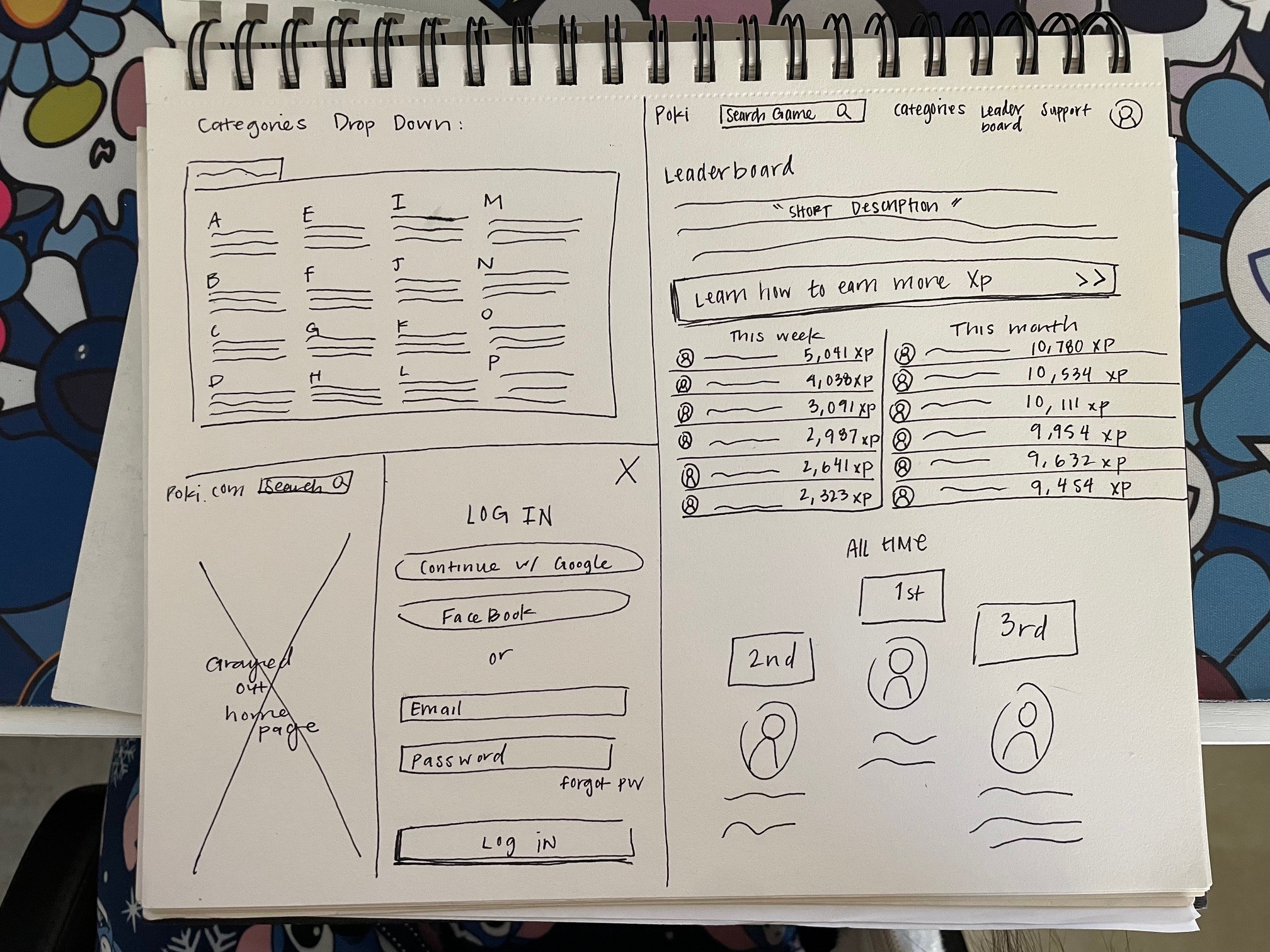
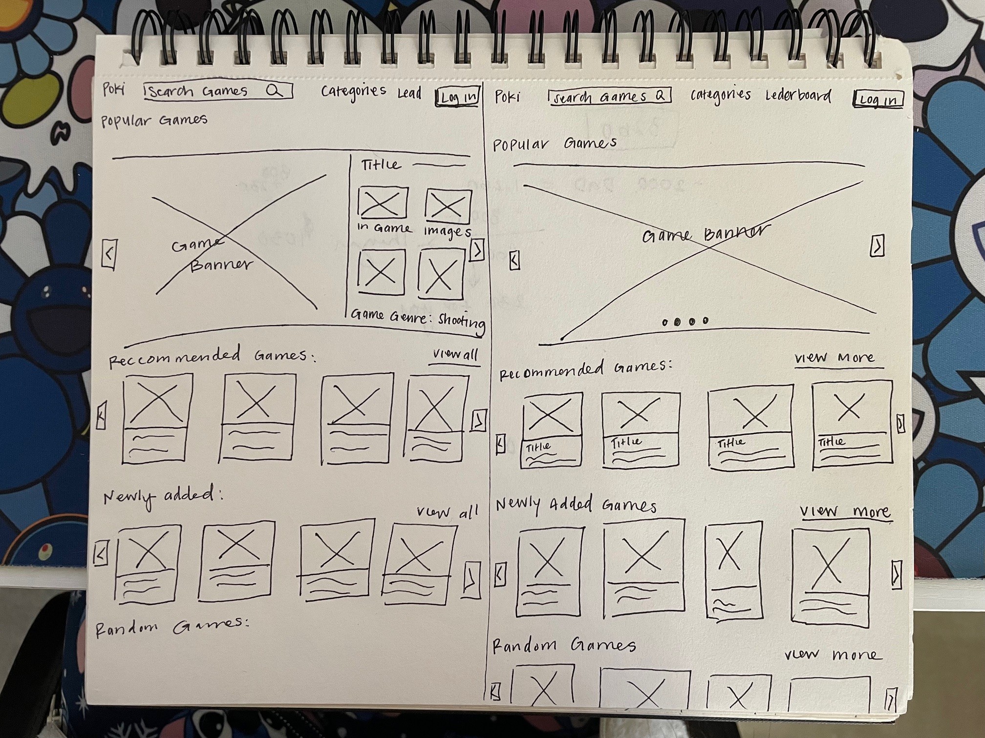
I first started off with sketches to test the different potential user interface possibilities that would most effectively aid my user's goals.
I first started off with sketches to test the different potential user interface possibilities that would most effectively aid my user's goals.
I first started off with sketches to test the different potential user interface possibilities that would most effectively aid my user's goals.
I first started off with sketches to test the different potential user interface possibilities that would most effectively aid my user's goals.




Mid-Fidelity wireframes:
Mid-Fidelity wireframes:
Mid-Fidelity wireframes:
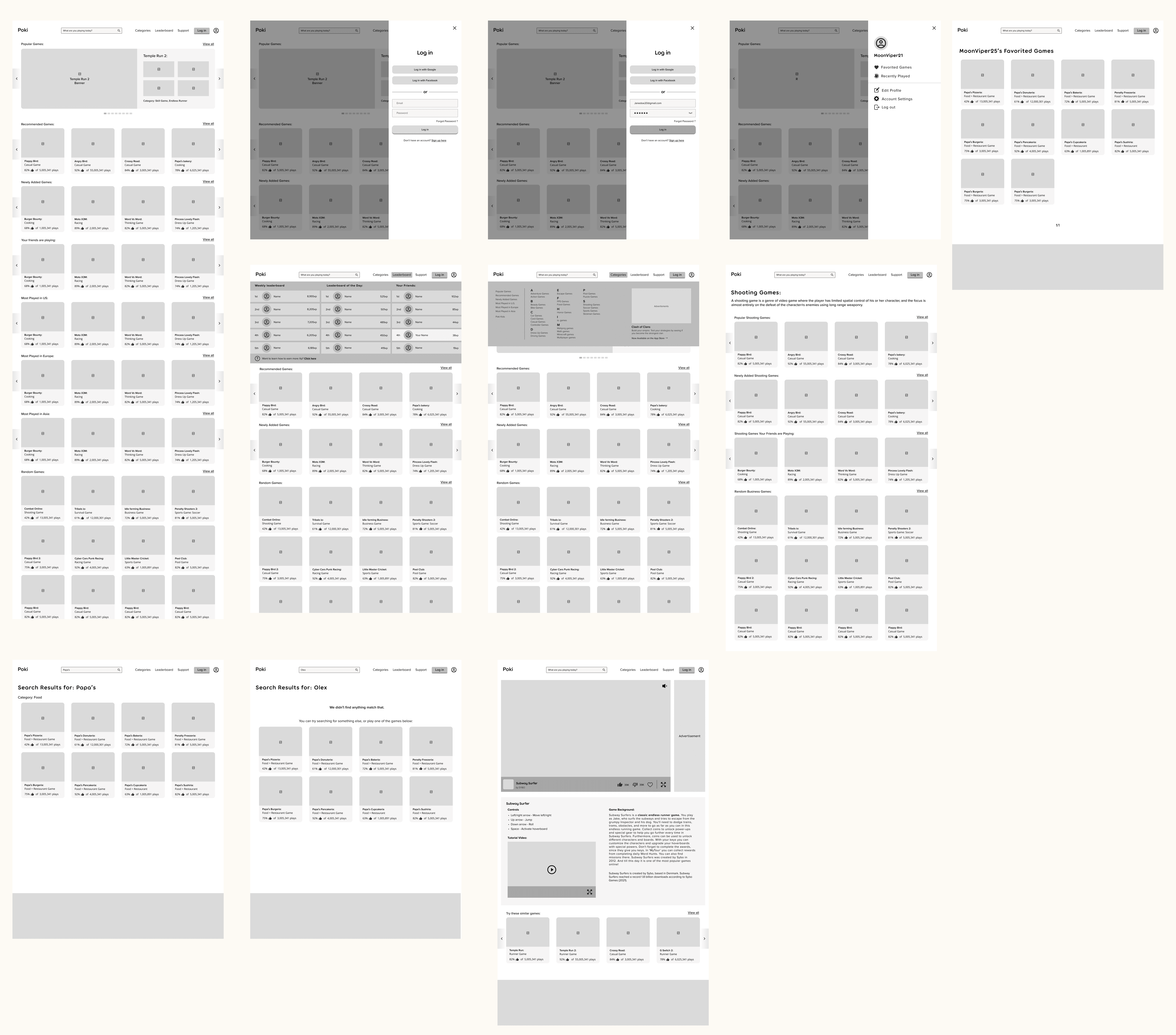
Once the sketches did well at representing the potential layout of our product, I moved onto mid fidelity wireframes.
Once the sketches did well at representing the potential layout of our product, I moved onto mid fidelity wireframes.
Once the sketches did well at representing the potential layout of our product, I moved onto mid fidelity wireframes.
Once the sketches did well at representing the potential layout of our product, I moved onto mid fidelity wireframes.


Changes implemented to the mid-fi:
Changes implemented to the mid-fi:
Game card layout:
Game card layout:
Game card layout:
Game card layout:


Took out arrow scrolls to maximize space for additional game display.
Narrowed game cards sizes to allow more space for a fifth card to bleed out off screen and imply scroll ability.
Took out arrow scrolls to maximize space for additional game display.
Narrowed game cards sizes to allow more space for a fifth card to bleed out off screen and imply scroll ability.
Took out arrow scrolls to maximize space for additional game display.
Narrowed game cards sizes to allow more space for a fifth card to bleed out off screen and imply scroll ability.
Took out arrow scrolls to maximize space for additional game display.
Narrowed game cards sizes to allow more space for a fifth card to bleed out off screen and imply scroll ability.


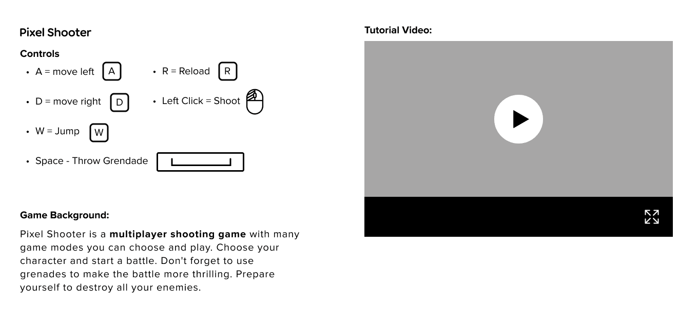
Game Info/Tutorial card:
Game Info/Tutorial card:
Game Info/Tutorial card:
Game Info/Tutorial card:
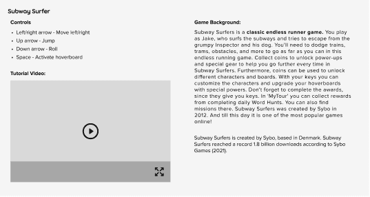


Rearranged content to put priority items such as controls and tutorials first.
Added icons/imagery for controls to assist users in better efficient learning.
Reduced game background content to be more concise.
Rearranged content to put priority items such as controls and tutorials first.
Added icons/imagery for controls to assist users in better efficient learning.
Reduced game background content to be more concise.
Rearranged content to put priority items such as controls and tutorials first.
Added icons/imagery for controls to assist users in better efficient learning.
Reduced game background content to be more concise.
Rearranged content to put priority items such as controls and tutorials first.
Added icons/imagery for controls to assist users in better efficient learning.
Reduced game background content to be more concise.


High Fidelity Wireframes
High Fidelity Wireframes
High Fidelity Wireframes
High Fidelity Wireframes
Incorporating everything we've learned and created from our sketches, mid-fidelity, and Poki's brand elements - I'm now able to develop our high-fidelity wireframes which allow us to not only visualize our product, but eventually test it's functionality. Besides successfully completing the task flows, we also wanted to ensure the site's re-design would positively impact it's usability.
Task Flows:
Log in and explore the leaderboard
Log in and explore the leaderboard
Log in and explore the leaderboard
Log in and explore the leaderboard
Search for game and add to favorites
Search for game and add to favorites
Search for game and add to favorites
Search for game and add to favorites
Sort for a game through categories and play the game
Sort for a game through categories and play the game
Sort for a game through categories and play the game
Sort for a game through categories and play the game
Updates to Poki.com's UI
Updates to Poki.com's UI
Updates to Poki.com's UI
Updates to Poki.com's UI
Home page/Game display
Home page/Game display
Home page/Game display
Home page/Game display
Original Site:
Original Site:


Redesign:
Redesign:
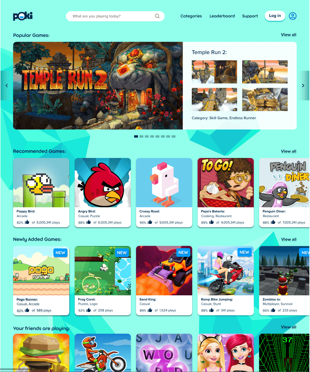


To directly tackle the usability issues identified in our heuristic evaluation and our user's negative responses to Poki.com. The key updates related to the site's homepage and game display involved:
Making the search bar more visible and accessible. (User's stated in the user interview of having difficulty distinguishing the location of the search bar)
Adding a navigation bar (To provide higher user control and freedom)
Redesigning the icons to be more consistent in order to reduce visual overload. (4/5 user's found the random sized game icons "distracting and not purposeful")
Provided more game information on the display cards. (User's had a hard time deciphering game type and popularity.)
Allowing user's personalized game recommendations sorted into genre's on the home/explore page. (Aids in sorting through the site more efficiently)
Category Display
Category Display
Category Display
Category Display
Original Site:
Original Site:


Redesign:
Redesign:
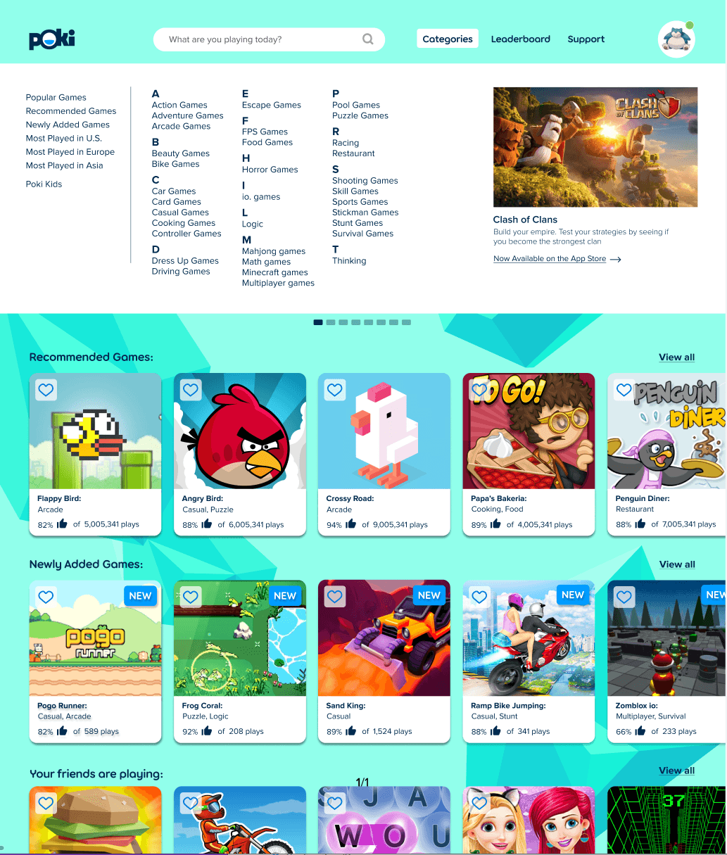


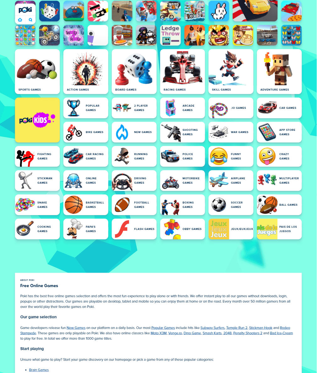
Poki's original method of displaying categories showcased usability issues for a variety of reasons.
It did not assist in maintaining consistency and standards. (Heuristic #4)
Contributed to the site's lack of recognition and recall. (Heuristic #6)
Prevents the site from having an aesthetic or minimalist design. (Heuristic #8)
User Complaints also heavily focused on the site's Category display. 100% of users showcased some form of dislike and want for improvement regarding it's visibility, accessibility, and relevancy.
The categories were displayed randomly in different places across the screen after clicked on. Otherwise usually at the bottom of the screen.
To address these issues a more concise category layout was designed that follows modern design trends for this feature. Allowing users to more efficiently navigate the site, without performing extraneous other steps like excessive scrolling.
Step 5: Test & Iterate
Step 5: Test & Iterate
Step 5: Test & Iterate


After designing the first version of high fidelity screens, we are going to examine the screens and their functionality by using a prototype and moderated "click-through" testing. Our goal is to identify if there are any usability issues or pain points are users face, and reiterate our screens based on our findings.
After designing the first version of high fidelity screens, we are going to examine the screens and their functionality by using a prototype and moderated "click-through" testing. Our goal is to identify if there are any usability issues or pain points are users face, and reiterate our screens based on our findings.
After designing the first version of high fidelity screens, we are going to examine the screens and their functionality by using a prototype and moderated "click-through" testing. Our goal is to identify if there are any usability issues or pain points are users face, and reiterate our screens based on our findings.
After designing the first version of high fidelity screens, we are going to examine the screens and their functionality by using a prototype and moderated "click-through" testing. Our goal is to identify if there are any usability issues or pain points are users face, and reiterate our screens based on our findings.
Prototyping in Figma
Prototyping in Figma
Prototyping in Figma
Prototyping in Figma
I set up my screens to be tested based on the task flows we created. Usability testing was conducted with 5 participants that match our persona.
I set up my screens to be tested based on the task flows we created. Usability testing was conducted with 5 participants that match our persona.
I set up my screens to be tested based on the task flows we created. Usability testing was conducted with 5 participants that match our persona.
I set up my screens to be tested based on the task flows we created. Usability testing was conducted with 5 participants that match our persona.
Tasks being tested:
Log-in and explore the leaderboard,
Search for a game and add to favorites.
Sort for a game through categories and play the game.
Tasks being tested:
Log-in and explore the leaderboard,
Search for a game and add to favorites.
Sort for a game through categories and play the game.
Tasks being tested:
Log-in and explore the leaderboard,
Search for a game and add to favorites.
Sort for a game through categories and play the game.
Tasks being tested:
Log-in and explore the leaderboard,
Search for a game and add to favorites.
Sort for a game through categories and play the game.


Synthesizing Our Test Results
Synthesizing Our Test Results
Synthesizing Our Test Results
Task 1: Log-in and explore the leaderboard
Task 1: Log-in and explore the leaderboard
Task 1: Log-in and explore the leaderboard
Task 1: Log-in and explore the leaderboard
Success Metric
Success Metric
Success Metric
Success Metric
Testing Results
Testing Results
Testing Results
Testing Results
Goal Met?
Goal Met?
Goal Met?
Goal Met?
User's ability to complete task in a short amount of time.
User's ability to complete task in a short amount of time.
User's ability to complete task in a short amount of time.
Under 1 minute for 5/5 users
Under 1 minute for 5/5 users
Under 1 minute for 5/5 users
Little to no error or tension while attempting to complete task.
Little to no error or tension while attempting to complete task.
Little to no error or tension while attempting to complete task.
0# of errors displayed by 5/5 users
0# of errors displayed by 5/5 users
0# of errors displayed by 5/5 users
User's positive experience with the design.
User's positive experience with the design.
User's positive experience with the design.
5/5 users showcased fast understanding and positive reactions with words such as organized, and interactive.
5/5 users showcased fast understanding and positive reactions with words such as organized, and interactive.
5/5 users showcased fast understanding and positive reactions with words such as organized, and interactive.
Task 1: Search for a game and add to favorites
Task 1: Search for a game and add to favorites
Task 1: Search for a game and add to favorites
Success Metric
Success Metric
Success Metric
Success Metric
Testing Results
Testing Results
Testing Results
Testing Results
Goal Met?
Goal Met?
Goal Met?
Goal Met?
User's ability to complete task in a short amount of time.
User's ability to complete task in a short amount of time.
User's ability to complete task in a short amount of time.
Under 1 minute and 30 seconds for 5/5 users
Under 1 minute and 30 seconds for 5/5 users
Under 1 minute and 30 seconds for 5/5 users
Little to no error or tension while attempting to complete task.
Little to no error or tension while attempting to complete task.
Little to no error or tension while attempting to complete task.
3/5 users described the process as straightforward but wanted an accelerator feature added to make this more efficient.
3/5 users described the process as straightforward but wanted an accelerator feature added to make this more efficient.
3/5 users described the process as straightforward but wanted an accelerator feature added to make this more efficient.
User's positive experience with the design.
User's positive experience with the design.
User's positive experience with the design.
5/5 users described the task flow as still overall easy to navigate and aesthetic.
5/5 users described the task flow as still overall easy to navigate and aesthetic.
5/5 users described the task flow as still overall easy to navigate and aesthetic.
Task 1: Sort for a game through categories and play the game
Task 1: Sort for a game through categories and play the game
Task 1: Sort for a game through categories and play the game
Success Metric
Success Metric
Success Metric
Success Metric
Testing Results
Testing Results
Testing Results
Testing Results
Goal Met?
Goal Met?
Goal Met?
Goal Met?
User's ability to complete task in a short amount of time.
User's ability to complete task in a short amount of time.
User's ability to complete task in a short amount of time.
Under 2 minutes for 5/5 users
Under 2 minutes for 5/5 users
Under 2 minutes for 5/5 users
Little to no error or tension while attempting to complete task.
Little to no error or tension while attempting to complete task.
Little to no error or tension while attempting to complete task.
5/5 users were able to complete the task without any frustration
5/5 users were able to complete the task without any frustration
5/5 users were able to complete the task without any frustration
User's positive experience with the design.
User's positive experience with the design.
User's positive experience with the design.
5/5 user's described the experience as simple, and showed approval for the newly added tutorial/game key feature.
5/5 user's described the experience as simple, and showed approval for the newly added tutorial/game key feature.
5/5 user's described the experience as simple, and showed approval for the newly added tutorial/game key feature.
Key Iterations
Key Iterations
Key Iterations
Key Iterations
Iterate the adding a game to favorites flow - create a shortcut so that players don't have to fully click on a game just to add it to favorites.
3/5 expressed that if they already played a game before, felt it redundant to have to click on the game page just to add to favorites. Especially if they didn't want to play that game at that moment but just wanted to save for later
Before
Before
Before


After Iteration:
After Iteration:
After Iteration:


Step 4: Results and Next Steps
Step 4: Results and Next Steps
Step 4: Results and Next Steps
Usability testing validated the success of this redesign of Poki.com. Despite this, there are still many more ways we could enhance the site's usability and explore new features.
Usability testing validated the success of this redesign of Poki.com. Despite this, there are still many more ways we could enhance the site's usability and explore new features.
Usability testing validated the success of this redesign of Poki.com. Despite this, there are still many more ways we could enhance the site's usability and explore new features.
Usability testing validated the success of this redesign of Poki.com. Despite this, there are still many more ways we could enhance the site's usability and explore new features.
Further exploration
Further exploration
Further exploration
We managed to successfully tackle many prominent issues pertaining to Poki's usability. By following successful design patterns established and well used by the general public in intersecting industries.
But to further improve Poki.com's user engagement there's a couple things we could try:
Piggyback off the leaderboard and explore more ways Poki.com could potentially explore it's user engagements. Many user's mentioned that they like using the site with friends or in a competitive manner. How can we increase the level of community engagement
Further test our design to see if there are any other pain points or frustrations user's might encounter and figure out how to modernize Poki.com's site in a familiar way that tackles these issues.
Explore my Other Projects:
Explore my Other Projects:
Explore my Other Projects:


Netflix
Netflix
Netflix
Explore Netflix like you've never have before.
Explore Netflix like you've never have before.
Explore Netflix like you've never have before.


PetPal Ai
PetPal Ai
Work smarter not harder to be the best pet parent you can be.
Work smarter not harder to be the best pet parent you can be.


